This article covers the colors used throughout the HomeSeer system.
Primary Colors
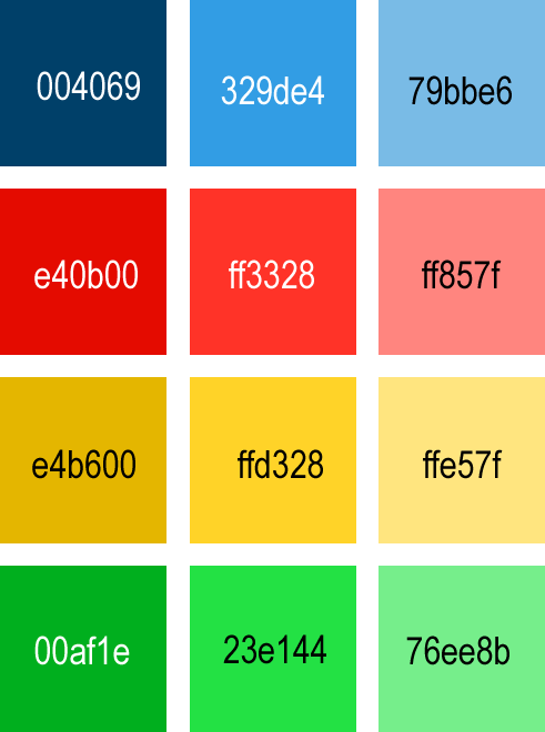
The HS4 software uses four colors throughout the interface: red, blue, green, and yellow. The usage of these colors throughout the software in plugins should be deliberate, following the guidelines below.
Generally, bolder colors should be reserved for notifications so as to grab a user's attention, while softer colors should be reserved for backgrounds. On the subject of cohesion, if multiple colors will need to be used in a page, card, or other material, it is recommended to select colors which are neighbors in the grids.
Blue
This is the color of the HomeSeer brand. As such, it should be used for elements that a user should be aware of, but are neutral. This applies to control buttons, device names, and other buttons.
rgb(50,157,228)
#329DE4
.hs-blue
.hs-bg-blue
rgb(0,64,105)
#004069
.hs-blue-dark
.hs-bg-blue-dark
rgb(121,187,230)
#79BBE6
.hs-blue-light
.hs-bg-blue-light
Red
Generally reserved for status indicators where there is a serious error.
rgb(255,51,40)
#FF3328
.hs-red
.hs-bg-red
rgb(228,11,0)
#E40B00
.hs-red-dark
.hs-bg-red-dark
rgb(255,133,127)
#FF857F
.hs-red-light
.hs-bg-red-light
Yellow
Useful as a status indicator for warnings. A warning should be something that may require a users attention, but will not break the system or their home if ignored.
rgb(255,211,40)
#FFD328
.hs-yellow
.hs-bg-yellow
rgb(228,182,0)
#E4B600
.hs-yellow-dark
.hs-bg-yellow-dark
rgb(255,229,127)
#FFE57F
.hs-yellow-light
.hs-bg-yellow-light
Green
If the status of a device or plugin is positive and as expected, then this should be displayed in green to immediately put the user at ease.
rgb(35,225,68)
#23E144
.hs-green
.hs-bg-green
rgb(0,175,30)
#00AF1E
.hs-green-dark
.hs-bg-green-dark
rgb(118,238,139)
#76EE8B
.hs-green-light
.hs-bg-green-light
Other Variations
The four primary colors also have lighter and darker variants. Additionally, varying degrees of opacity can be applied in ~22% increments to give your plugin the desired look while making sure that it will not clash with what we have designed or with what other developers have created in order to provide a cohesive experience for the user. Examples can be seen in the associated color tables.
Text Colors
Opacity can be adjusted for text as well! The images to the right outline the three possible values of opacity that should be applied for both white and black text.