A view used for presenting multiple options from which a single item can be selected.
On this page:
Usage
A select list allows users to complete tasks that involve making a choice from a predetermined set of options. These are most often used on settings and device configuration pages to select a specific mode of operation. There must always be at least two available options to choose from.
Types


Dropdown Menu
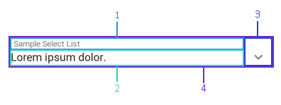
A dropdown menu is a compact way of displaying multiple choices a user can pick from. When a user clicks on the view, a popup is shown with a list of the available options they can select from.
When to use
A dropdown menu should be used when all available options can be collapsed to only show the selected item. If there are only a couple of options, or it is necessary to display every available option on the screen, consider using radio buttons.
Anatomy
-
Title (name)
-
Currently selected option name
-
Action icon
-
Clickable region

Layout
Dropdown menus will stretch horizontally to fill all available space on the page. Text, including the title and currently selected option name, are left justified while the action icon is right justified.
Radio Buttons
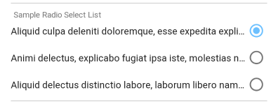
Radio buttons show a list of available options that a user can select from.
When to use
A list of radio buttons should be used when there are a small number of available options or when there is a need to display all of the options on the screen at once. If the list can be collapsed, consider using a dropdown menu to conserve screen space.
Anatomy
-
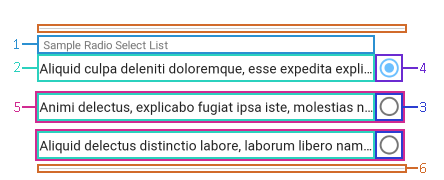
Title (name)
-
Option name
-
Action icon
-
Action icon (selected option)
-
Clickable region
-
Divider

Layout
Radio buttons are displayed in a group with horizontal dividers at the top and bottom to separate the available options from the rest of the views on the page. The title is left justified, but the available option names and their action icons are right justified.
Implementation
Implement this on a page using HomeSeer.Jui.Views.SelectListView.

