A view used to indicate a binary (on/off) state that users can control.
On this page:
Usage
Toggles allow users to turn an option on or off or select multiple items from a list.
Types

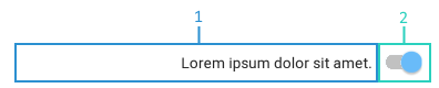
Switches
Switches toggle the state of a single setting on or off.
When to use
Switches should be used when an option can be toggled on or off. This commonly activates or deactivates something. If you have multiple toggles that relate to one-another, consider using checkboxes instead.
Anatomy
-
Name
-
Action icon
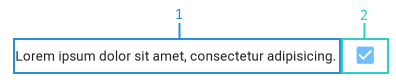
Checkboxes
Checkboxes allow a user to select one or more items from a set. This can be used to turn options on or off.
When to use
Checkboxes should be used when there are a set of related options that can be toggled on or off or selected. If there is not a significant relationship between the options, then consider using switches instead.
Anatomy
-
Name
-
Action icon
Layout
Toggles will stretch horizontally to fill all available space on the page. The name and action icon are both right justified.
Implementation
Implement this on a page using HomeSeer.Jui.Views.ToggleView.