Describes how to develop your own custom cards and share them with others.
This document contains information for developers who wish to create their own custom cards that can be displayed on an HS4 Dashboard. Custom cards are HTML files that include Scriban tags so the card can display dynamic content. Scriban is a popular tag language based on Shopify Liquid Tags. Scriban documentation is here:
scriban/doc at master · scriban/scriban · GitHub
Getting Started
It helps to start your project with a working example. Make a copy of the card_text.html file and give it a new name. To copy the card, put any dashboard into edit mode then click the + icon on the right side of the page to bring up the Add Card dialog. Click on the copy icon on the “Display Text” card to make a copy. Enter a new name for the card and click save. You can now edit your new card. The cards are located in the HomeSeer install folder in:
html\Dashboards\Cards\Custom
Edit your copy of the html file and change the contents at the top of the page. The original contents look like this:
{{#Name=Display Text}}
{{#Description=Displays text}}
{{#Version=1.0}}
{{#Author=HomeSeer}}
{{#CanBeDeleted=False}}
{{#SaveList=save_text_size,save_text_color,save_text_bold}}
This information is used by HS4 to manage the card, such as listing the card in the cards list when adding a card to a dashboard. Change the information for your card. The copy process would have changed the name already.
Cards are standard HTML cards and can edited with any HTML editor. Notepad++ is an excellent editor as well as Visual Studio or Visual Studio Code.
The Card HTML supports Scriban Tags. Scriban allows you to create dynamic pages. HomeSeer provides a rich set of functions that can be used on your pages. See the HTML Tags documentation in the Plugin SDK docs.
If you are using a HomeSeer Linux controller if might be more difficult to edit the file on the box since the OS is limited. An option is to install the Windows Version of HS4 on a PC and create your cards there (or another Linux box). Your HS license can be used on any system that is on the same network as your original HS4 install.
Card Format
TBD
Installing Your Card
After you have tested your card, it can be distributed for use on other systems. Cards can be distributed in one of two ways:
-
If the card does not require any other content files, the html file may be given out. Users simply upload the file from the cards list. Note that no preview graphic will be available with this method.
-
A zip file that contains the card, content files, and a preview image.
To distribute your card using a zip file, create a folder and add your html card file, an install.json file, and a folder named “Content” which contains a preview.png file. The preview graphic will be displayed in the cards list when a user adds a card to their system.
The install.json file uses the following format. This is sample for a test card zip:
{
    "VersionDependent": "",
    "CardFile": "card_test.html",
    "ContentFiles": [
        {
            "FileName": "preview.png",
            "OverWrite": true
        }
    ]
}
Where:
|
JSON Field |
Description: |
|---|---|
|
VersionDependent |
Set this is an HS4 version number if your card requires a feature that requires a special version of HS4 like 4.2.22.84. |
|
CardFile |
The filename of your card file |
|
ContentFiles |
An array of files that should be installed in the Content folder. This should contain at least one file, the preview.png file. If your card requires other files such as a config file, or an include file like css, add it to this list and include the file in the Content folder in the zip. The preview image should be 264 pixels wide and no more than 100 pixels high |
|
ContenFiles:FileName |
The name of the content file |
|
ContentFiles:OverWrite |
Tells the install process if an existing file should be overwritten. Most of the time you would want this to be true. If you have some kind of user config file, you may not want the file to be overwritten, in which case set this to false |
The folder with all your files will like something like this:
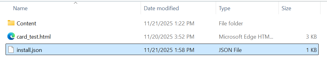
To create the zip, select all of these files and add them to a zip file. A typical name for the zip file would be the card name.zip, in this case “card_test.zip”.
The zip file can now be selected when adding a new card from the cards list dialog. Select the upload icon in the upper right corner of the dialog.